The problem
Retail employees at REI were spending too much time navigating an inefficient interface to find the information they needed while helping customers. The mobile app they relied on needed to be redesigned to provide easier, more efficient access to product and inventory information. Several new tools also needed to be developed to improve operational efficiency for the Co-op and give employees better ways to help customers in the store.
Reframe. The brief was "redesign the app." The work became "reduce the time spent navigating the app."
Approach
Before starting any design work, I needed to understand the store environment and the tasks employees performed throughout their day. I visited multiple stores and conducted interviews and observations to learn how their daily routines actually played out on the floor.

Research
Alongside the interviews and observations, I looked into the demographics of the broader group of employees working in stores across the country. I combined that information with what I'd learned from the contextual interviews and in-store observations to build a set of employee profiles. The profiles guided my design decisions and kept the team focused on the people who would be using the software every day. I also ran evaluative usability testing on the existing app to establish a baseline time-on-task for its primary features.
What we observed, ranked by frequency
- Single-handed use, often while holding something else
- Typed search became non-performant when exposed to typing inaccuracies
- Feature taxonomy confused users
- Many features hidden when access was needed most
- Employees unaware of certain app capabilities
Initial concepts
Working from the research, I identified the usage patterns and behaviors that had taken hold around the original interface. Understanding the employees' goals was essential to making it faster and easier for them to scan and find information. Once I had a clear picture of the pain points, I started sketching changes to the interface, developing a series of wireframes that eventually became a rough prototype I could put in front of users.
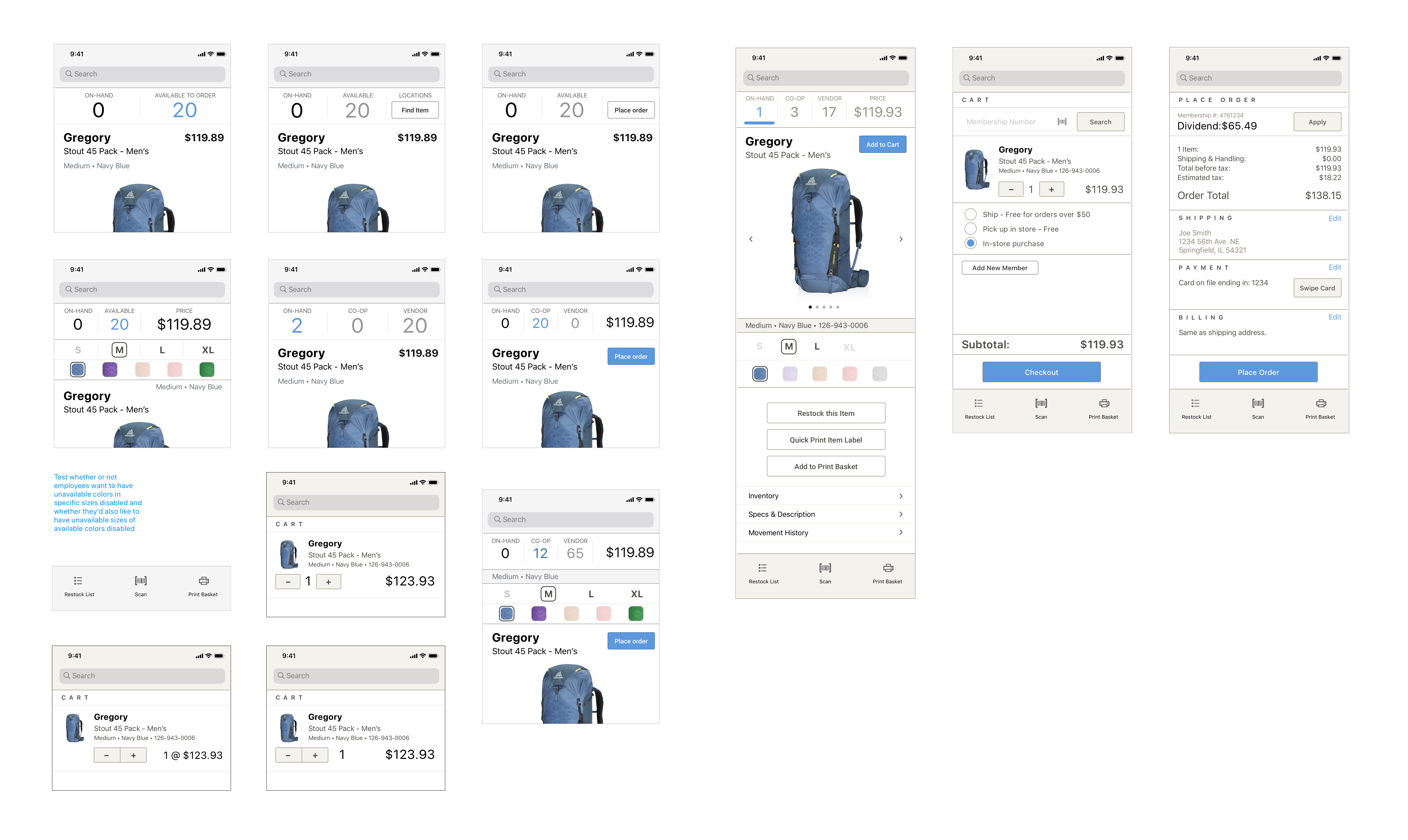
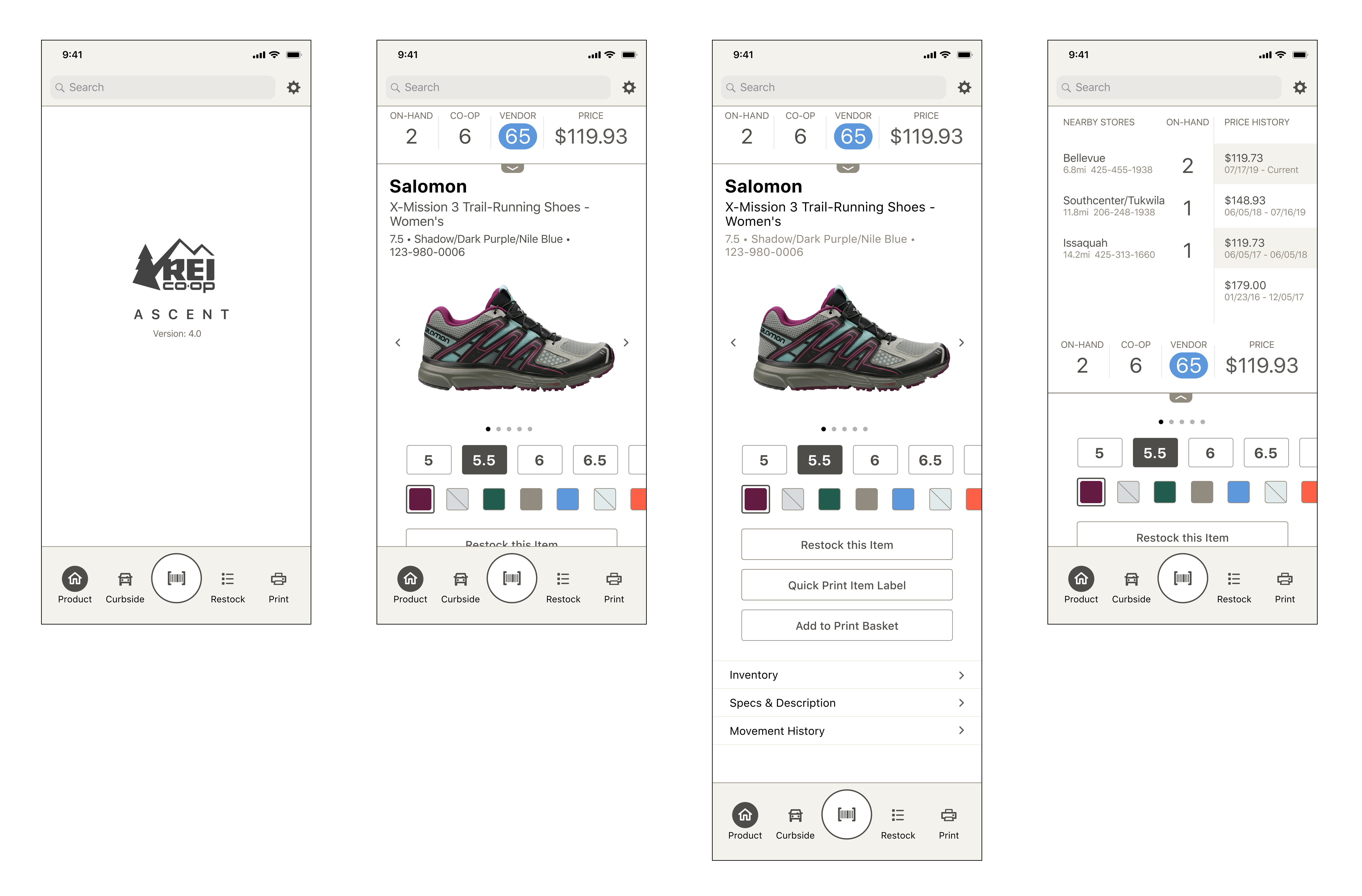
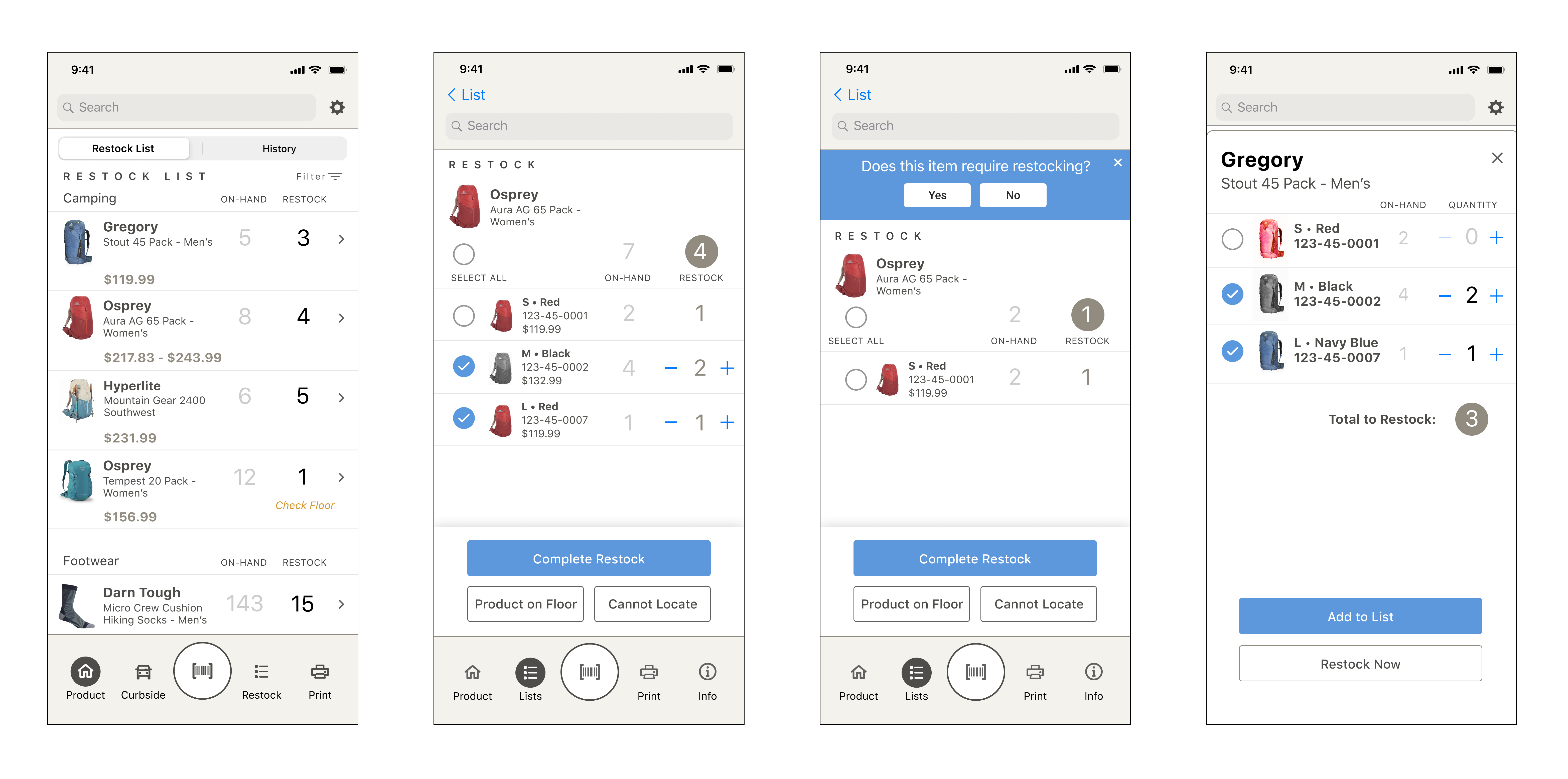
Final design
After several rounds of usability testing and iteration, the design began to solidify. With a clearer view of how employees were interacting with the app while working, I developed the final design around their specific needs — placing more emphasis on inventory information and giving search and scan global access so employees could pull up information quickly and easily.
Prototype & Implementation
Once the prototype had tested well and I was confident the design fit the way employees worked, I shared it with the Engineering team to assess level of effort and feasibility against the existing backend systems. From there it was story mapped and folded into the team's Agile development process. As new features came up, I built a UX roadmap that ran alongside the product and engineering roadmap to keep design and development moving in step.
Results & ongoing improvements
Based on feedback from employees, I continued revising the prototype and shared updates with the product and development team. I also established baseline surveys to monitor employee satisfaction with the app. The overall benefit to the Co-op from these changes was equivalent to roughly 20,000 hours per year no longer spent navigating the interface — time given back to employees so they can spend it with customers rather than a mobile device.
The redesign delivers approximately 20,000 annual hours saved in interface navigation — time employees now spend with customers rather than devices.