The problem
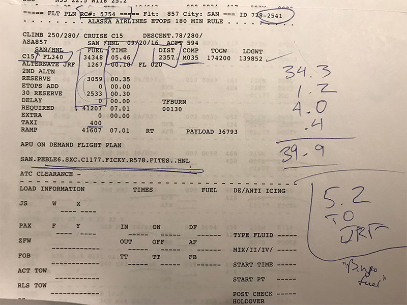
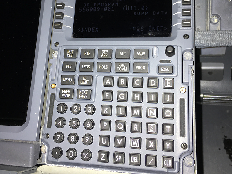
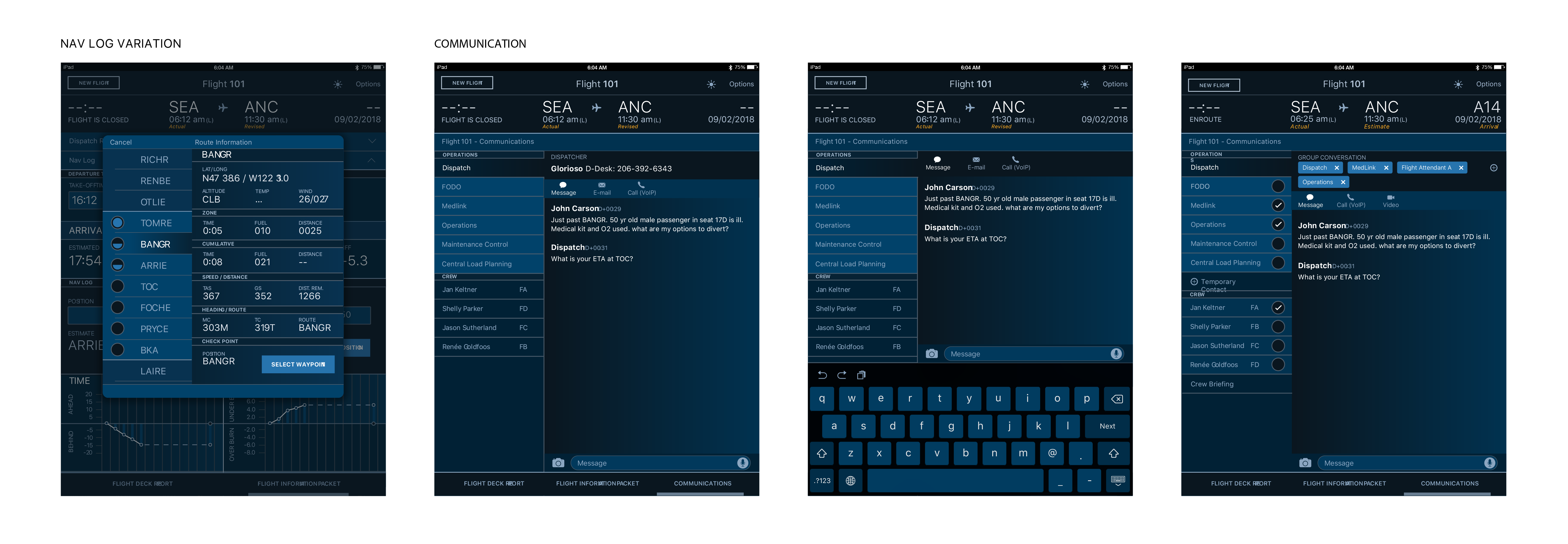
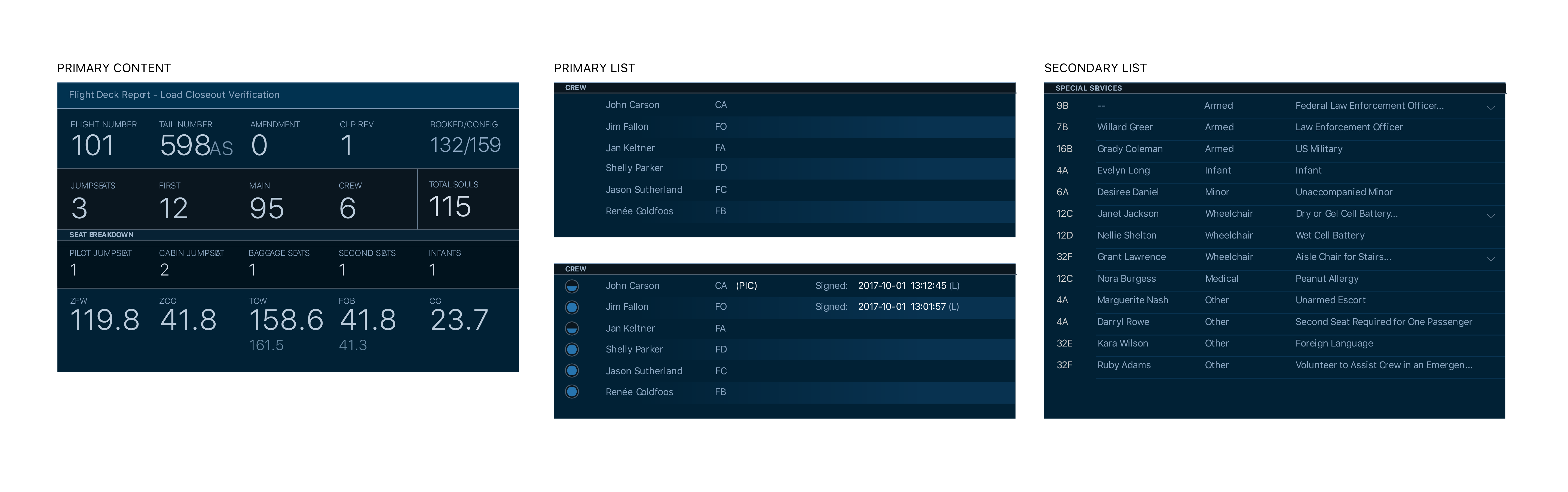
Alaska was wasting time and resources printing final flight paperwork and hand-delivering it to the crew so flights could depart on schedule. The airline needed a way to better use existing technology to keep flights on time. On top of that, pilots were spending too much time sorting through irrelevant or unhelpful data to find the information they actually needed to fly the plane.
The opportunity. Certain information is required by pilots before a decision can be made to push back from the gate. Digitizing and restructuring that information around the pre-departure checklist could return significant time to the flight deck.
Approach
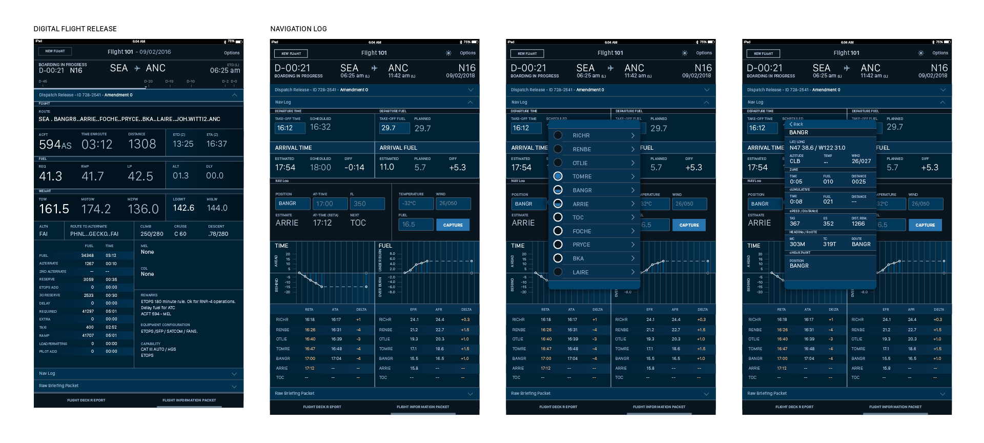
Pilots need certain information before they can decide to push back from the gate. Most of that information was reaching them as computer printouts that were cryptic and difficult to parse. My approach was to learn which pieces of that paperwork were actually valuable to pilots in making those decisions, and then surface that information in a way that fit their existing pre-departure processes and checklists.

Research
I conducted formative research, gathering both quantitative and qualitative data about our pilots. I used what I learned to develop a set of user personas the team could refer to throughout design and development. The same research also helped me identify and prioritize the information that was most critical to pilots' decision-making.

When discussing how they consumed flight plan data, many pilots stated that "all" the information was important. However, when pressed, a clear hierarchy began to emerge — a subset of information was driving the majority of their decision-making.
A process of reducing the irrelevant and clearly surfacingthe relevant data began.
Design
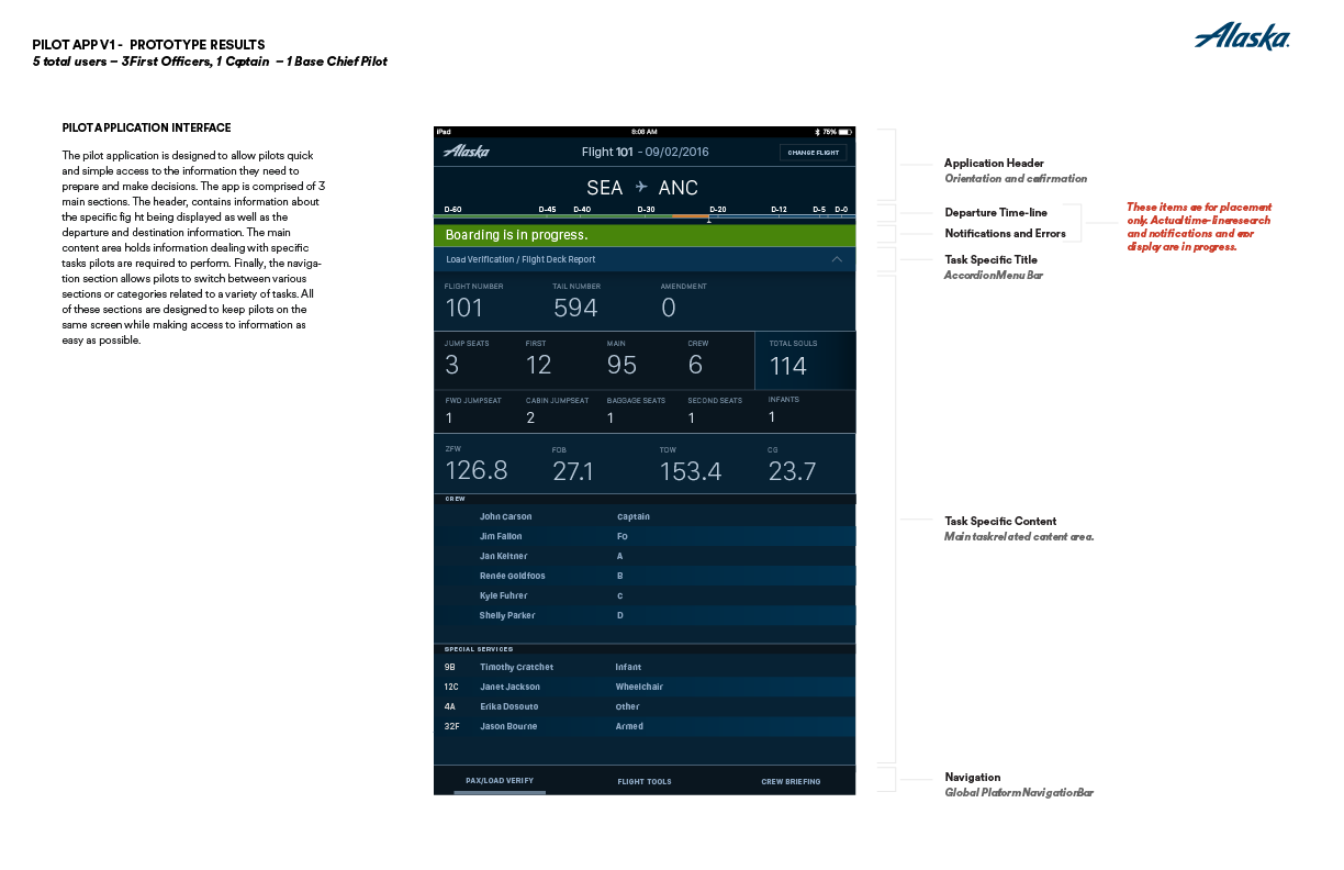
Through several user interviews and observations, I built a better understanding of how pilots prepare for and plan their flights. Once I'd identified the pieces of information most crucial to their decision-making, I developed an information structure that led with what mattered most and built a hierarchy around those needs. After collecting feedback from pilots, I adjusted the layout so the hierarchy followed the flow of their pre-flight process and made it easier to compare information that had previously been difficult to line up side by side.
Prototype
Once the layout was refined, I built a prototype that let pilots consume the information the way they would when preparing for a flight. Their feedback helped me refine the prototype further, and I shared it with the development team as we headed into development sprints. We then shared our progress with a group of beta pilots before deploying the final solution to the fleet.
Results & ongoing improvements
Based on feedback from pilots, I continued to revise the wireframes and share updates with the development team. We also built metrics into the app to monitor its health and usage over time. The overall benefit to the company was equivalent to roughly 200 tons of paper and $20 million in operational time saved per year — time given back to pilots so they could focus on other flight-related activities.