Problem
Bocada is a leader in data protection services management. They were in need of a design refresh for both their client-side and enterprise web applications. Along with a visual refresh, Bocada needed to rework their “success/failure” indicator to make it more accessible for color-blind users.
Research
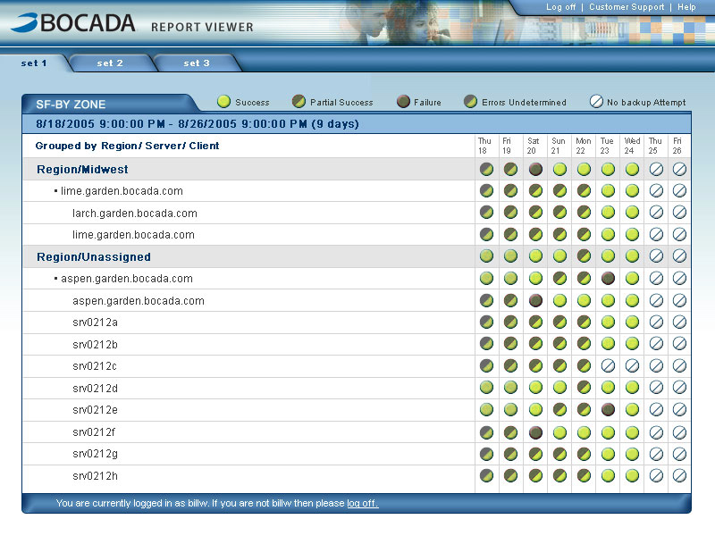
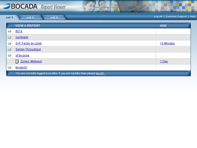
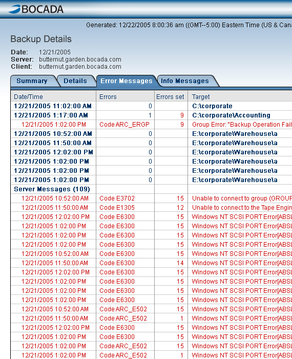
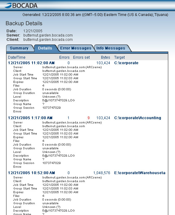
Before discussing the scope of the project, it was important to look at the original application from a visual standpoint. An assessment of the original screens helped me determine the time and effort involved in redesigning the application interface. It was important to identify any inconsistencies in the way the information was displayed so that guidelines could be established and a visual style could be created.
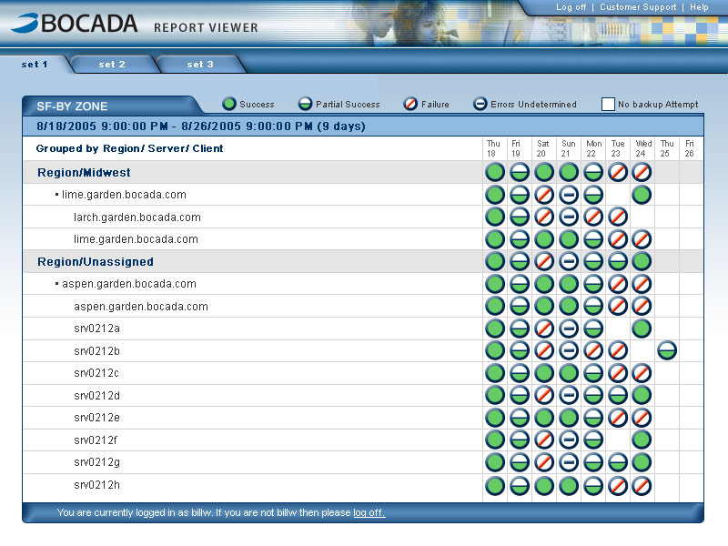
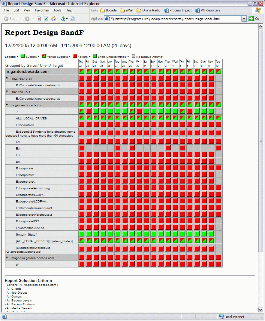
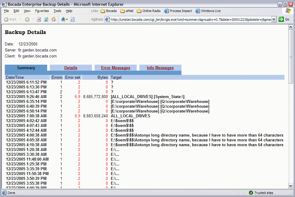
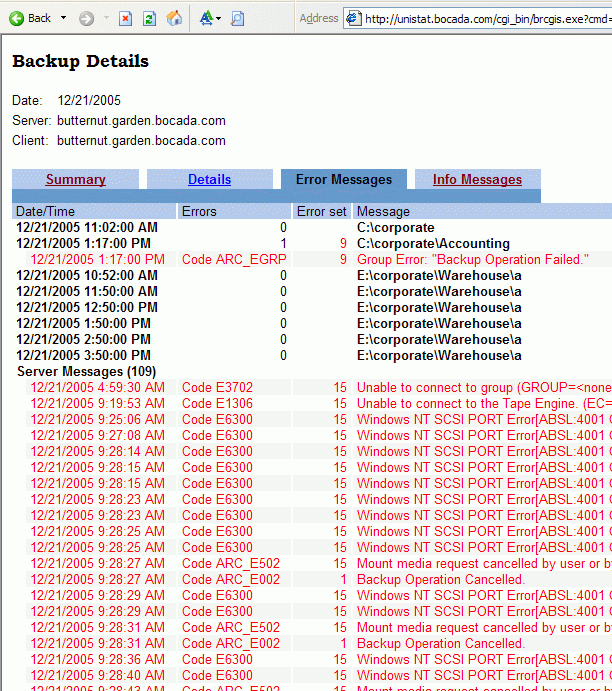
Bocada: Research
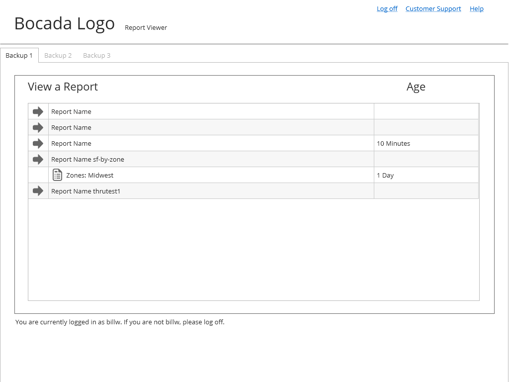
Original Web-Application Screens
Developing Wireframes
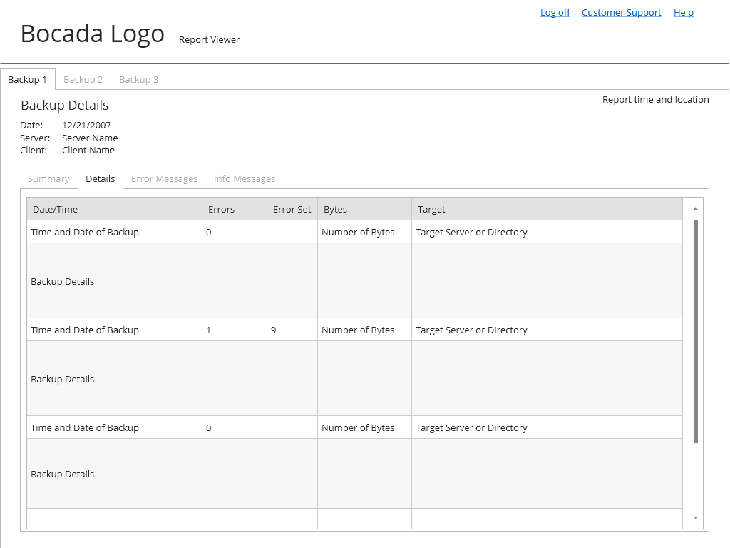
After disucssing the initial scope of the project, sketches and wireframes were created to capture the content hierarchy on the main application screens. The focus was on displaying—clearly—the information needed by the client while reducing the importance of information that was secondary. Once the content hierarchy was finalized, work on the visual design began.
Bocada: Wireframes
Consumer Web Application

Visual Design
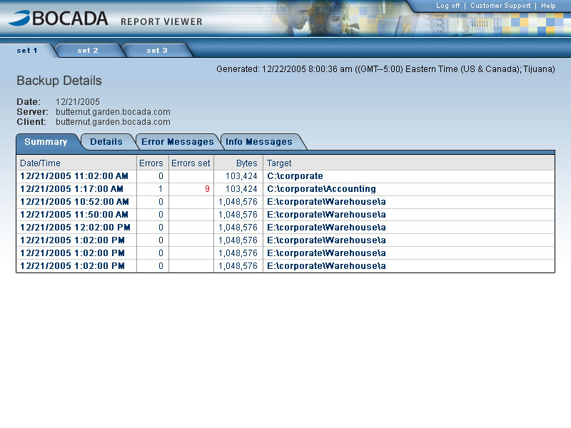
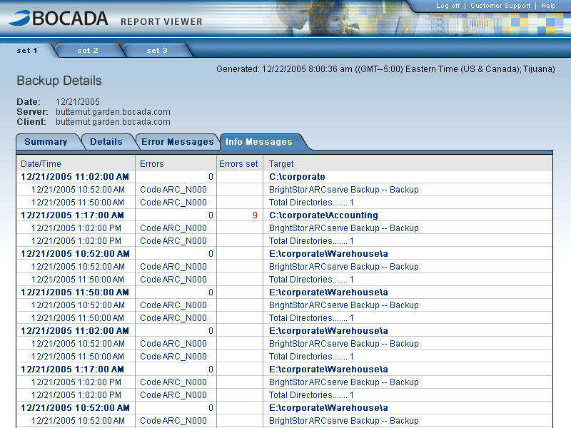
Once work on the visual design began, several iterations were reviewed and revised. Displaying a consistent header was identified as the main focus of the visual update. This consistency helped reinforce the Bocada Brand in the all of the various ways in which the content was accessed. The following finalized mock-ups were created to demonstrate how this visual consistency would take form. When final stakeholder approval was received, assets and redlines were created and handed to development.
Bocada: Visual Design
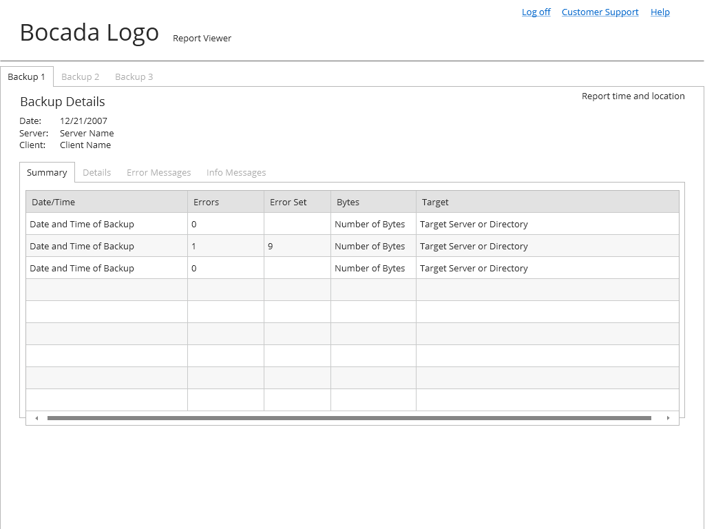
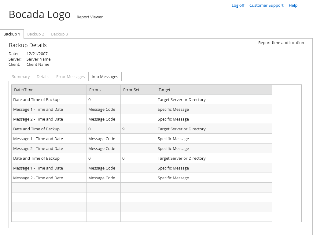
Consumer Web Application
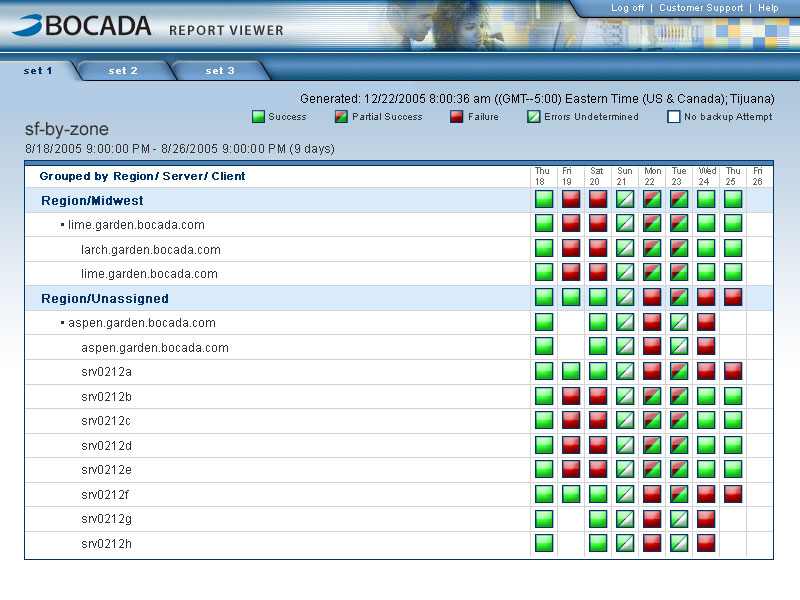
Colorblind Accessibility
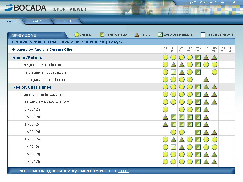
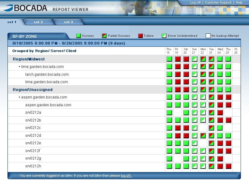
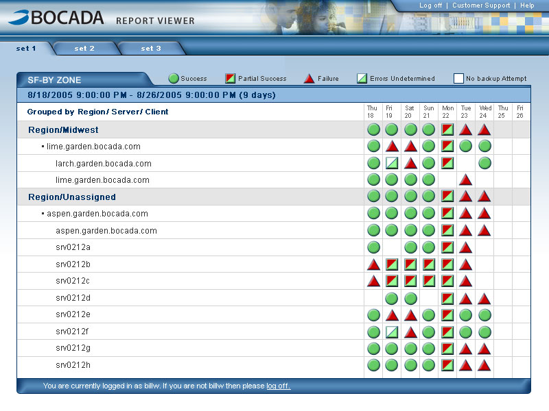
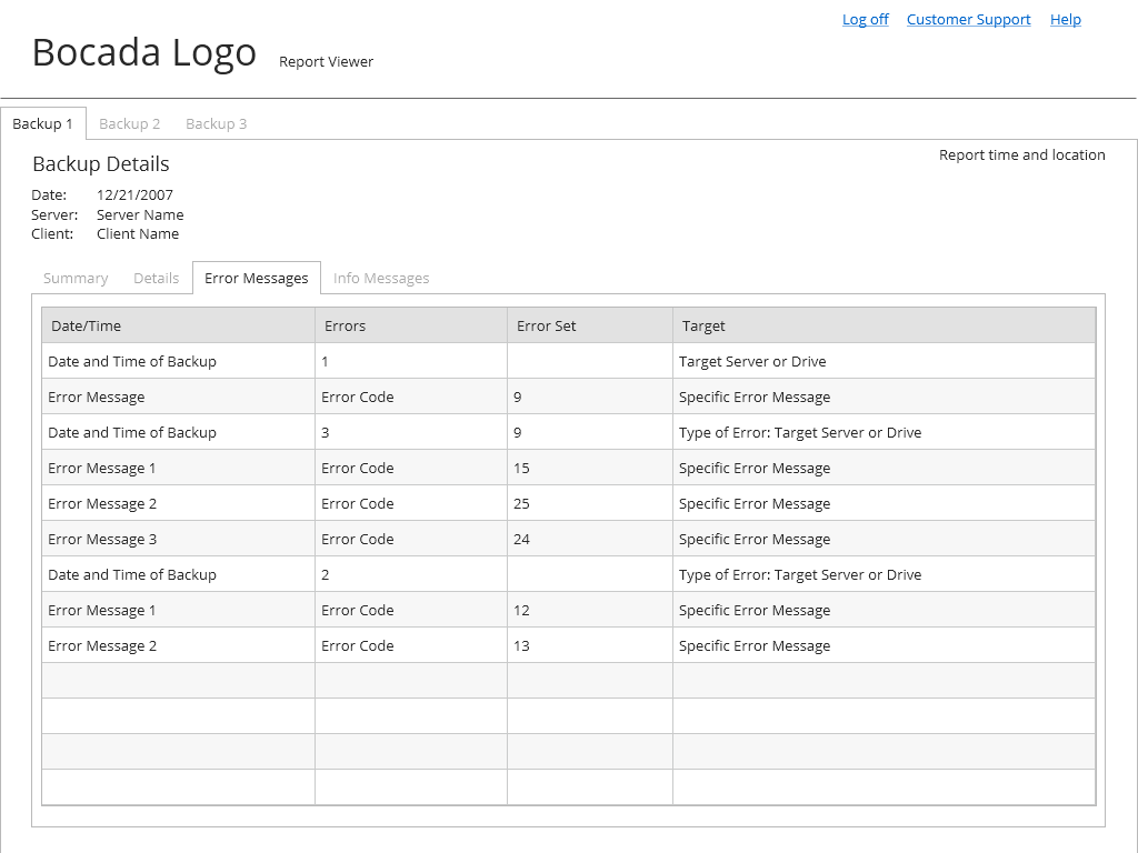
During the design process, issues regarding the accessibility of the “success and failure report” were identified. Specifically, the original use of red and green was problematic for users suffering from deuteranopia (red-green color blindness). Using a color-blind simulator, several iterations were developed looking specifically at how color-blind users were experiencing the interface. The final solution relied on a combination of shape, color and contrast to clearly distinguish the various states of success and failure in the interface.
Bocada: Visual Design
Color Blind Explorations