Problem
Self Service saves customers time and saves Alaska Airlines valuable employee resources. The kiosk user-experience is in need of an overhaul. I was tasked with looking at the kiosk customer-experience from the ground up. What is the function of the kiosk in the future of the Alaska Airlines ecosystem? How can we improve the experience as technology evolves?
Research
Before I could begin working, I had to understand who was actually using the kiosk. It took a variety of methods to gather data including, airport observations, surveys, data-analysis, heuristic evaluations, user-interviews and usability testing. After gathering data, I began working on methods for personalizing the experience and focusing on where the user is in the journey.
ALASKA AIRLINES KIOSK
Age and Kiosk Usage – Research


Personas
Using the information gathered during the research phase, I began developing personas that captured the major demographics represented by Alaska’s kiosk customers.

Concept
Once I had a clearer picture of who was using the kiosk, the task of identifying what features they needed became more evident. Depending on age, income level, whether they were alone or with a group all determined how they were going to use the kiosk and what features they needed the most. The research indicated a clear difference in age and a users need to reprint a boarding pass after checking-in. After following up with interviews we determined that many users were reprinting their boarding pass as a back-up to their digital boarding pass, or using their digital boarding pass as a back-up to the printed one. This showed a clear need for the ability of the kiosk to serve those who want a back-up boarding pass for security and shed light on an opportunity to enhance the appearance of reliability in our digital products.
Kiosk: Sketches
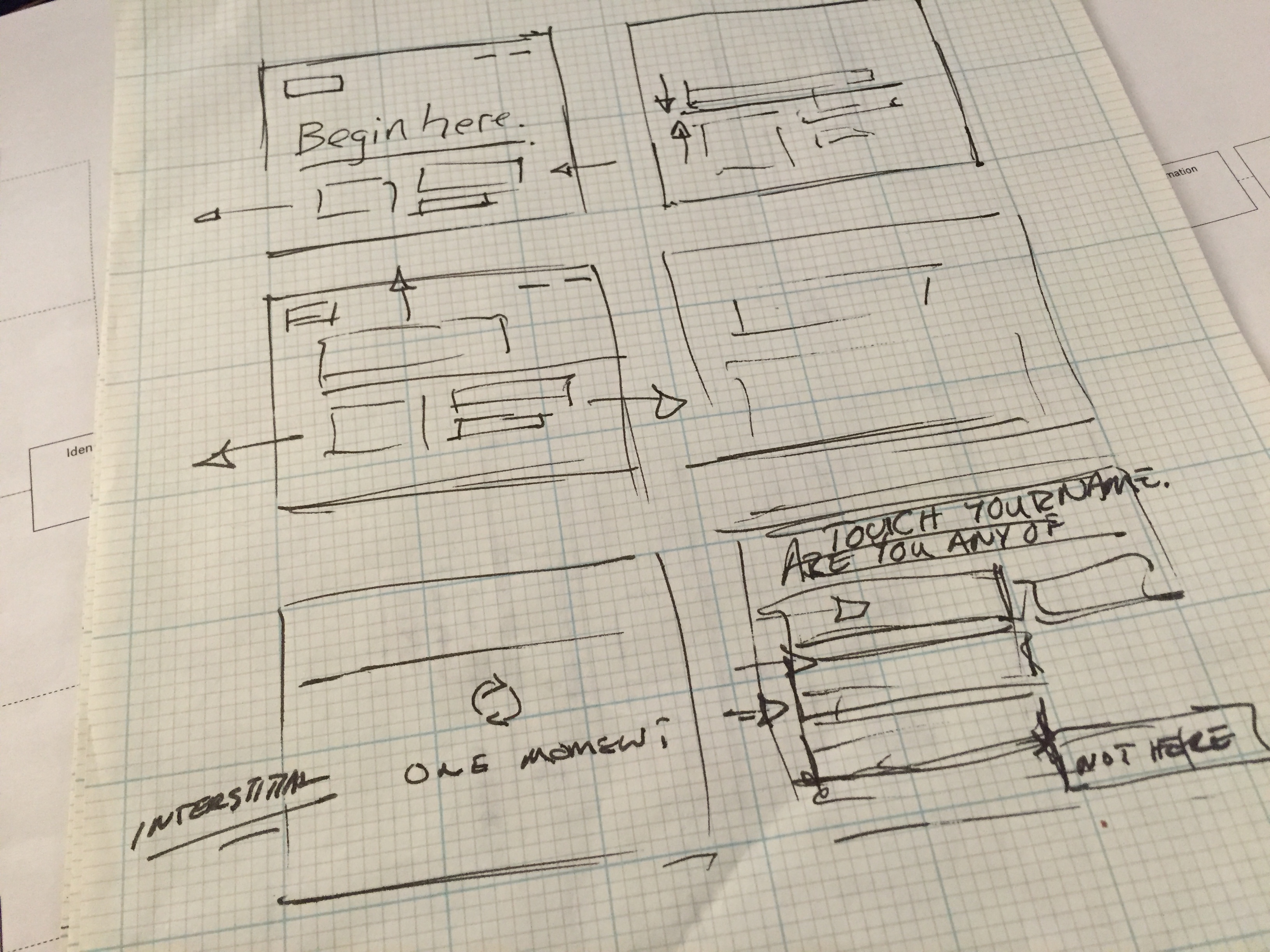
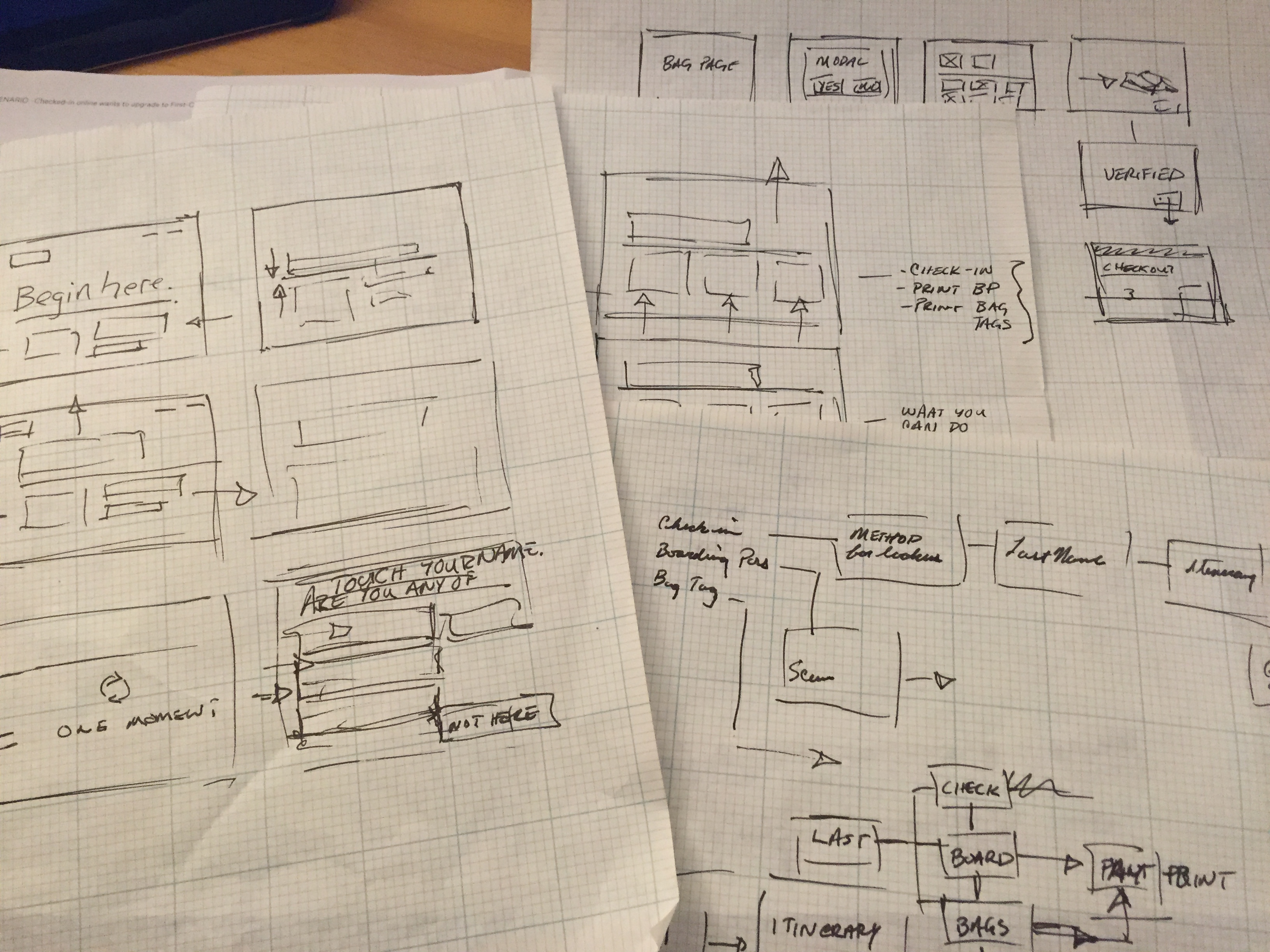
Design
Based on the research gathered around the kiosk and it’s users, the design of the kiosk needs to be very conversational in tone. The information contained on the kiosk needed to be personalized without betraying user’s privacy. The Attract screen needs to be highly visible while showing users methods for interaction as well as the benefits of the kiosk. The process for finding a travel reservation needs to be streamlined and options for finding the reservation need to be reduced. A cart-based payment system must be implemented to make the payment processes simpler, and opportunities to create delight for the customer should be implemented through devices such as simple animations. With these and many other recommendations in mind, wireframes were created to start addressing issues in the passenger identification process.
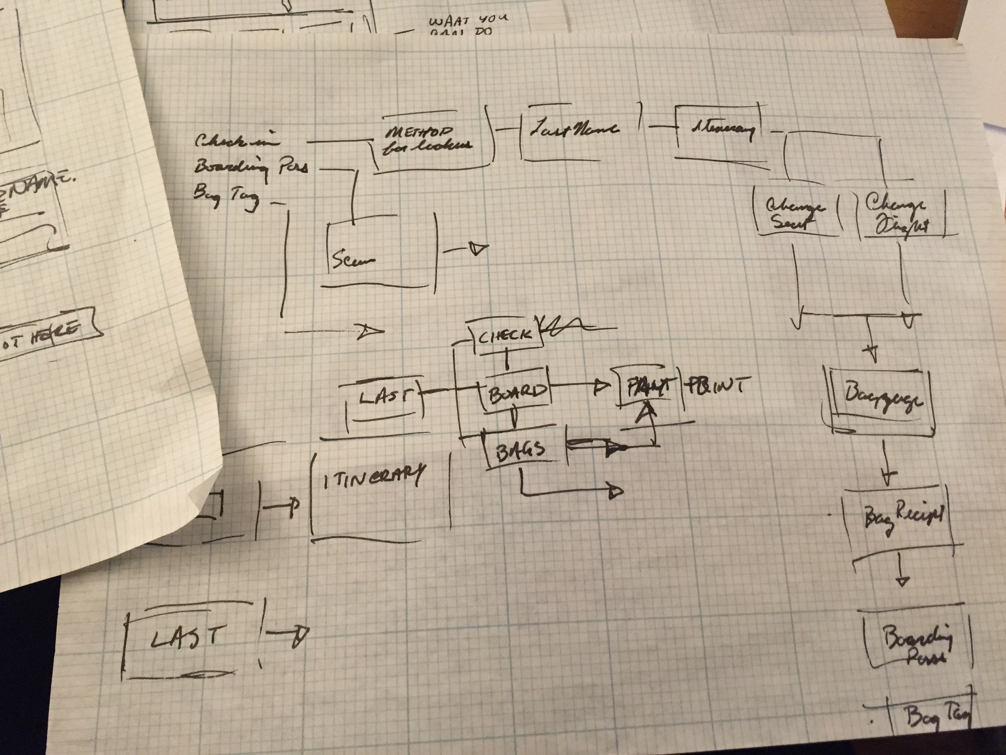
KIOSK: Content Architecture
Primary Task – Checking-in

KIOSK: Check-in Flow
Primary Task – Checking-in

KIOSK: Wireframes
Primary Task – Print Boarding Pass

Prototype
Once initial wireframes were produced and recommendations for improving customer interactions were developed, it was time to look at ways to improve the qualitative experience of interacting with the kiosk. A motion study was created to demonstrate ways to delight the customer through animation as well as give the appearance of speed through a variety of transitions that the make the entire experience feel more fluid and less one dimensional.